User Interfaces
Check this out in the mean time: Leo Burnett’s design studio. You will be impressed with the design, variety of user-interface solutions and visual effects.
I fancy the idea of making non-linear interfaces and avoiding menu-ish look. The existing paradigm has turned into habits of our users already and its dearly hard to break this stereotype. The more applications we write, the more our users go down into the swamp of their stereotypes. The sites (which are also the applications of some sort), like Leo Burnett’s, is a lot of fun to the visitor not only for its fancy graphics, but also for its navigation approach. It doesn’t grate on your eyes since it looks unusual and surprising at first. Two minutes of education and you are “operating” the site, like a pro, since it’s still intuitive and easy to learn.
When you are in “free flight”, it’s hard to maintain overall style and paradigm of your user interface because you aren’t bounded in your choices and it’s up to you how your creation will look and feel. There are no rules and limitations. In case of traditional menu-dialog interfaces we have a very limited set of tricks and objects to operate with and it makes every user half-way familiar with any application even before the start as it’s not required to learn how to work with an application, but only how to get most of it. Is that good or bad?
On one hand, of course, your aim is not learning an application graphical user interface, but using the application to help turning up trumps in some activity of yours. And, no doubts, having usual-looking interface is of a great help. But what if the performance is bounded and limited with the interface solution?

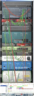
Lots of applications now days explore the new area of untraditional interfaces. Just take a look at the Propellerheads Reason. The picture shows the back of two-sided application screen, the front one is of course with lots of switches and knobs (see it yourself on the site). As it deals with creating music, the whole thing is presented in form of a rack, which can be filled with different modules. Surely the modules you place require some connection between each other to route sounds from the sources into effects modules and finally to the output mixer. But this routing doesn’t happen through menu or properties dialog boxes — it mimics the existing and most natural way of connecting things through the wires. In fact, the application has extremely limited number of dialog boxes which keeps it on top of usability and performance. Once you learn ten most helpful (to you) shortcuts, you start to create sounds and route the signals like a mad and it helps you to perform better and quicker. Isn’t that what we had started with?
Well, it was one of them from top of the head and I’m sure that you know more. What’s always left is a hope. The hope that at some moment this fantastic unprecedented growth of hardware performance will do its job and we will find ourselves in the future where there’s no menus, scroll-bars and notification areas; where we will need no mice, and especially single-buttoned. We have almost concured the virtual space in gaming and still pushing buttons on silly dialog boxes. What a shame!